Why Choose Our Visuals
Professional-grade custom visuals designed specifically for
enterprise Power BI
deployments. We empower data
professionals to tell compelling stories through innovative
visualizations.
- Built by data experts for data professionals
- Continuous updates and new features
- Comprehensive documentation and support
- Trusted by industry leaders worldwide
Easy Integration
Seamless plug-and-play installation directly into Power BI. No complex setup required, start visualizing immediately.
High Performance
Optimized for large datasets with lightning-fast rendering. Handle millions of data points without compromising speed.
Enterprise Grade
Built to meet enterprise security standards. Trusted by Fortune 500 companies for mission-critical analytics.
Explore Our Innovative Power BI Custom Visuals
Discover a range of powerful visualizations tailored for your data needs.
Ultimate Risk Matrix 2.0
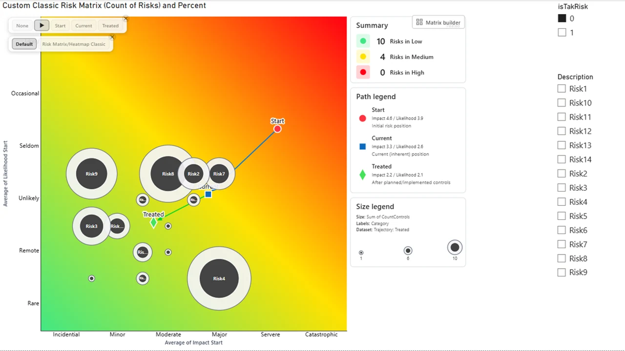
Ultimate Risk Matrix 2.0
Ultimate Risk Matrix 2.0 adds a Full Custom Matrix Builder, rectangular layouts such as 6×5, modern tooltips, configurable legends, animated trajectories, and new bubble designs.
Turn risk into clarity with Ultimate Risk Matrix 2.0. Build the layout that matches your methodology—from familiar 3×3, 4×4, 5×5, and 6×6 matrices to rectangular configurations such as 6×5. The Full Custom Matrix Builder brings sizing, independent axis values, band modes, colors, cell labels, and gridlines into one workflow. Define and rename up to ten bands, assign shapes by risk band or dataset, and use modern custom tooltips and configurable legends to explain each point. Dynamic trajectory animation shows how risk moves from initial through current to target states, while Core + Ring points and redesigned aggregated bubbles keep detailed and executive views readable. Use the Dataset Picker to compare multiple X/Y pairs in one visual. See risk clearly. Act confidently. Manage what matters.
Explore more Buy NowDGA Fault Triangles

DGA Fault Triangles
The DGA Fault Triangle is one of the most famous methods to interpret DGA results of a transformer.
The DGA Fault Triangle is a widely used method for interpreting DGA (Dissolved gas analysis) results of a power transformer.
It classifies transformer faults by comparing the relative concentrations of methane (CH₄), acetylene (C₂H₂), and ethylene (C₂H₄). We have 3 different types 1,4 and 5. Triangle 1 Method: Fault Diagnosis and Gas Analysis in Power Transformers , Triangle 4: Identifying Low-Energy Faults with Dissolved Gas Analysis , Triangle 5: Medium to High Energy Fault Identification. Download it now for Power BI from Microsoft Marketplace.
Explore more Buy NowUnlock the Power of Data with Custom Visuals
Transform your data into insightful visualizations that drive business decisions. Our Power BI Ready Visualizations are designed to work seamlessly with your data, providing you with the tools to create interactive reports and dashboards that captivate your audience.
Frequently Asked Questions
Find answers to common questions about our services.
Power BI Ready Visualizations are custom visuals designed for seamless integration with Microsoft Power BI.
You can install them directly from the Power BI marketplace or upload them manually.
Yes, our visuals are compatible with the latest versions of Power BI.
Absolutely! You can modify them to fit your specific data needs.
We provide comprehensive support and documentation for all our visuals.
Get Expert Support for Your Power BI Needs
Power BI Ready Visualizations transformed our data analysis process. The custom visuals are intuitive and seamlessly integrate with our existing workflows, enhancing our reporting capabilities significantly. Our team can now visualize complex data effortlessly, leading to better decision-making and insights. Highly recommend these visuals for any organization looking to elevate their data presentation!
Jason Harris
Data Insights CorpCustomer Service
For any questions or support needs, please contact our customer service team. We are committed to providing timely and effective solutions.
User Experience Insights
We value your feedback on our Power BI visuals. Share your thoughts to help us improve and serve you better.
Custom Visuals
Explore our range of custom visuals designed for seamless integration with Microsoft Power BI, enhancing your data visualization experience.
Get In Touch
Our dedicated support team is here to assist you with any inquiries regarding our Power BI visuals. Reach out for prompt assistance.